Study of light

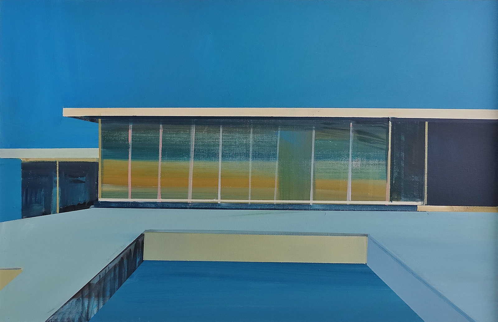
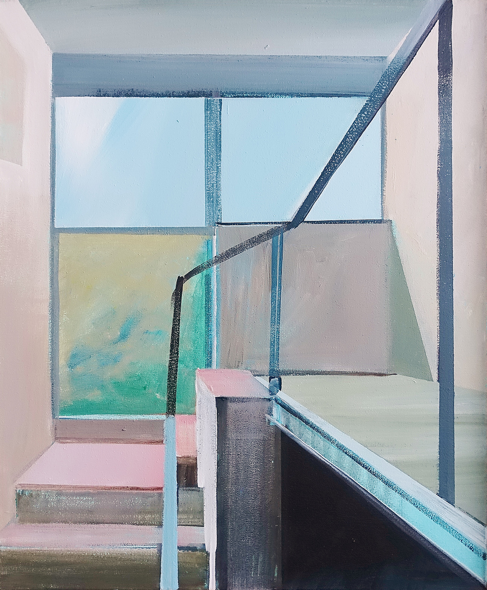
It is a house unlike any other. Or rather, it is three houses in one, joined by a common façade. Large windows – from the garden, and from the front, a row of small windows, like in a factory. A staircase resembling a captain’s bridge. And the rest of the five must-see points of Le Corbusier’s modern architecture: the open plan, the free façade, the garden on the flat roof with a spiral staircase leading up to it.
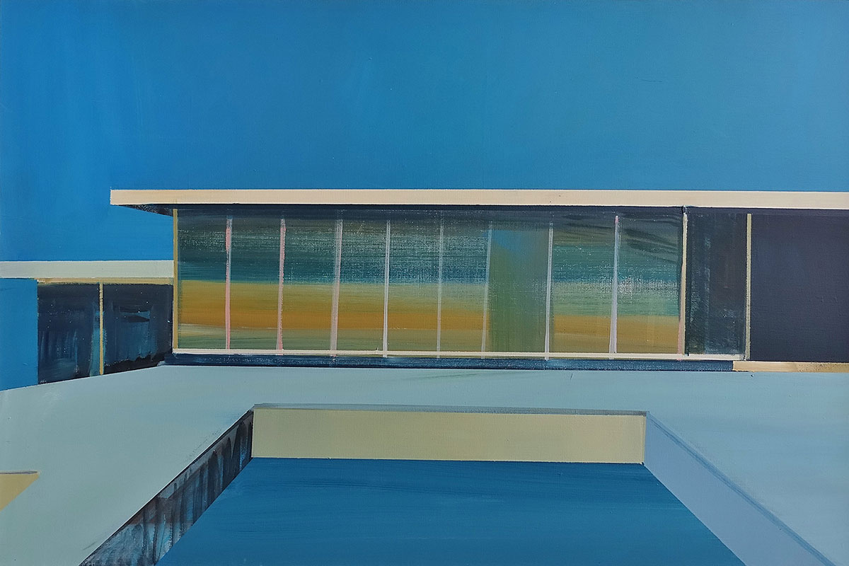
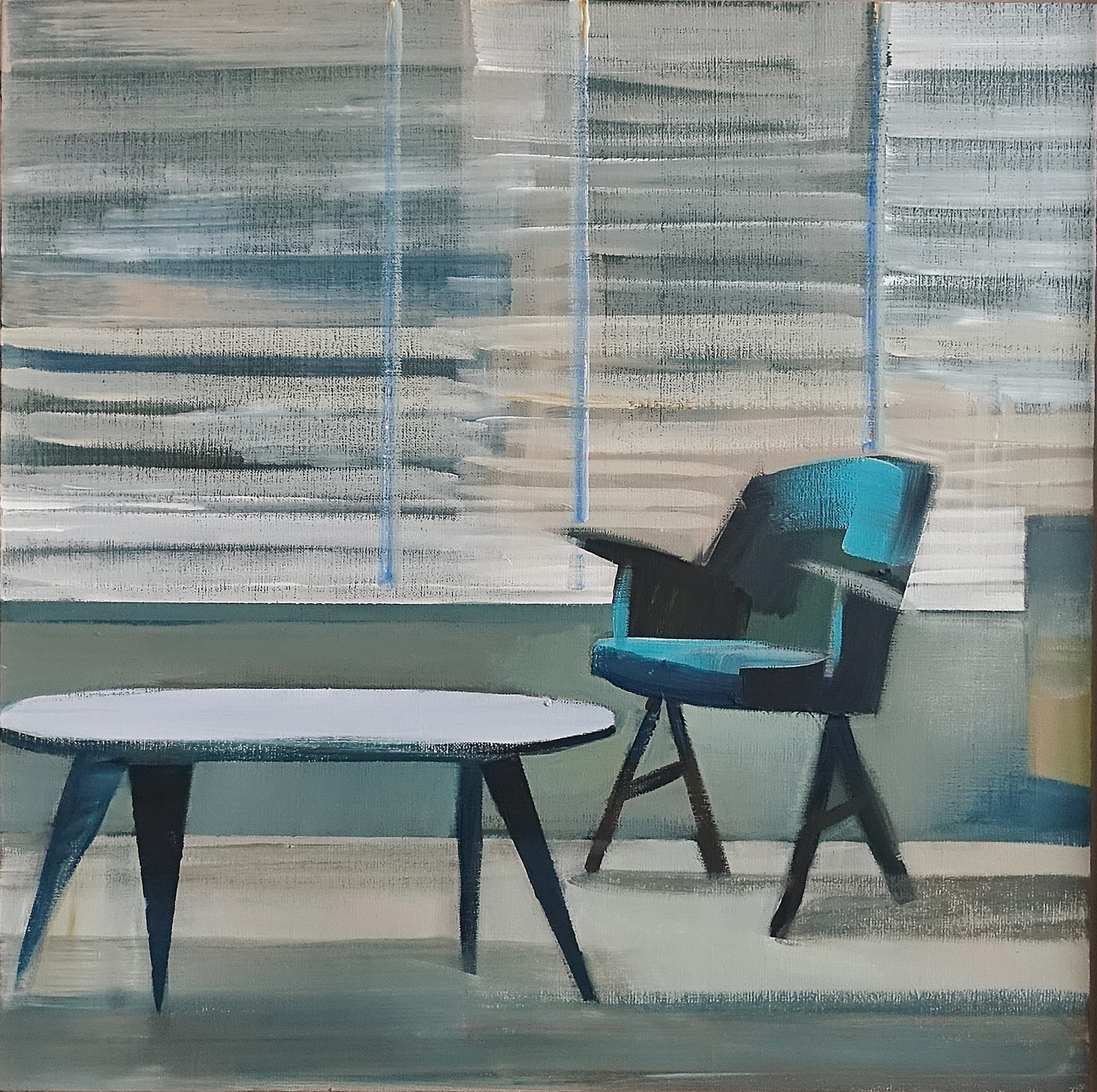
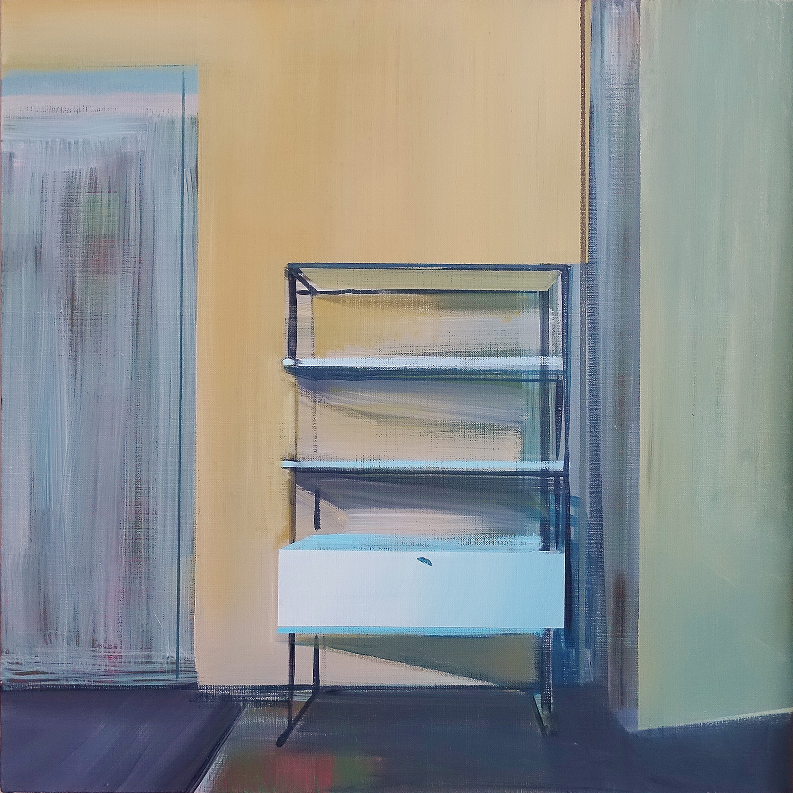
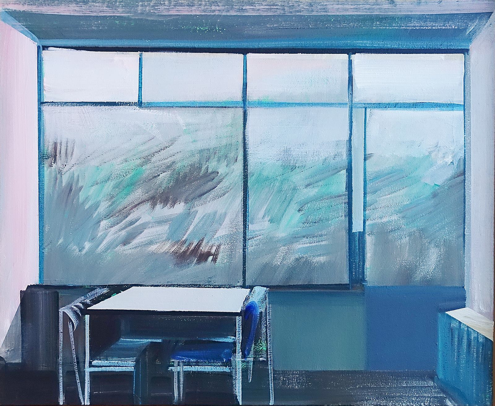
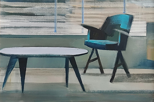
Inside, each of the three floors essentially acts as a separate flat. The kitchen, regarded between the wars as a household, dirty space, is located in the ground floor next to the entrance. On the same level, there is a microscopic toilet. There is no representative area, unless one considers the huge living room on the first floor as such, seeming to shout after Simon Syrkus, the main theoretician of the avant-garde group Praesens: ‘Down with the mass of the building!’ This architecture is free and open, merging with its surroundings as if melting into them. Throughout the house, you can play at searching for planes that create multidimensional compositions: the vertical, the horizontal and the depth. It was Mondrian, but also Strzemiński, who lectured the designer of the house, Bohdan Lachert, in these interiors about his theories: with the right handling of colours, plastic rhythms can be created in harmony with the rhythm of the interior. And in order to maintain spatial unity, it is best to use colours that contain the greatest variety of energy within them. Black, white, grey, yellow and blue – these are what was used. There was also hybrid furniture, also designed by Lachert, which was a perfect transposition of Strzemiński’s theory onto utilitarian objects. The entire lounge set, made of wood and metal, and each side painted in a different colour to break up the mass into several planes dividing the surface.
If it were not for this house, there might not have been any paintings by Maria Kiesner either. For in it, the family home at 9 Katowicka Street, the Dutch House Foundation has been operating for years. The architects who run it, Agnieszka and Tadeusz Bienias, one day gave the artist an album dedicated to the work of Gerrit Rietveld. Looking through it, they collectively marvelled at the state of preservation of his designs in the Netherlands. And at this point it is difficult not to mention the phenomenon of synchronicity described by Jung: history and time come full circle, for it was another house, precisely the house in the suburb of Utrecht that Rietveld designed for his friend Truus, that was a veritable obsession for Lachert while he was still a teenager. After a student trip to the Netherlands with Jozef Szanajca in 1926, he could not get over the fact that they did not manage to stop right there and see how it was made. The picture-house, a three-dimensional abstraction. A building with grey and white planes intersecting on its façade, contrasted with Mondrian’s primary colours – yellow, red and blue. Inside, sliding partition walls with the same colour scheme. The whiteness of the walls, accents of primary colours on the window frames, parts of the walls and floors and the furniture, including the famous red and blue lacquered wood chair, a design manifesto of the De Stijl group.
Thus, synchronicity: the Rietveld house inspired Lachert, while many years later, Lachert’s house enthralled the president of the Court of Justice in The Hague, Manfred Lachs, who purchased it and allocated it to a Dutch foundation in whose interiors Maria Kiesner studied Rietveld’s work. Her own paintings soon hung on the walls of the house – Lachert’s house among them. Thus, the barriers between inside and outside symbolically disappeared once again.
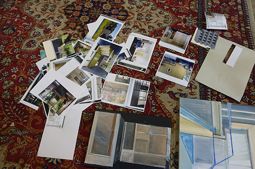
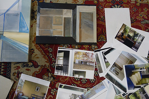
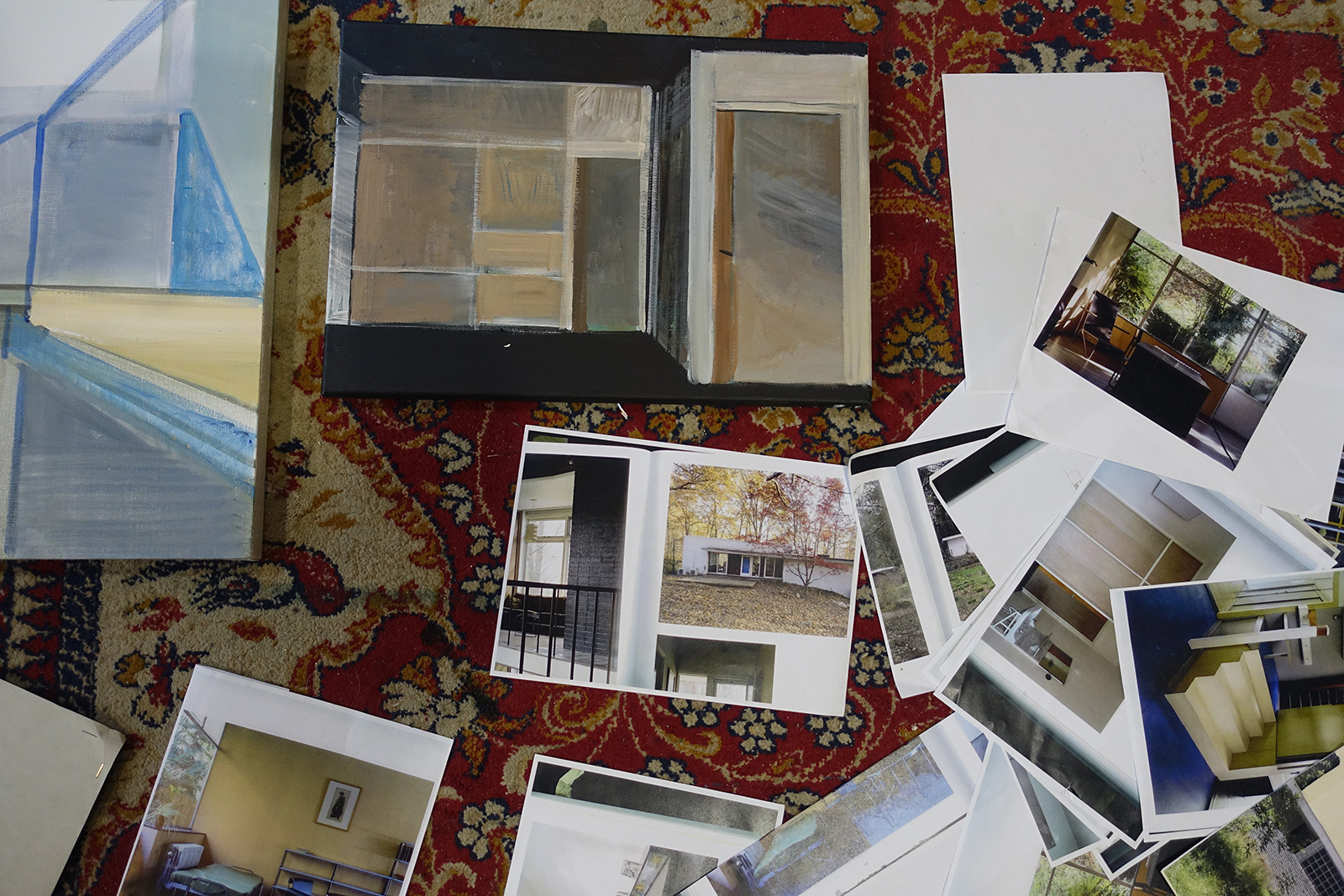
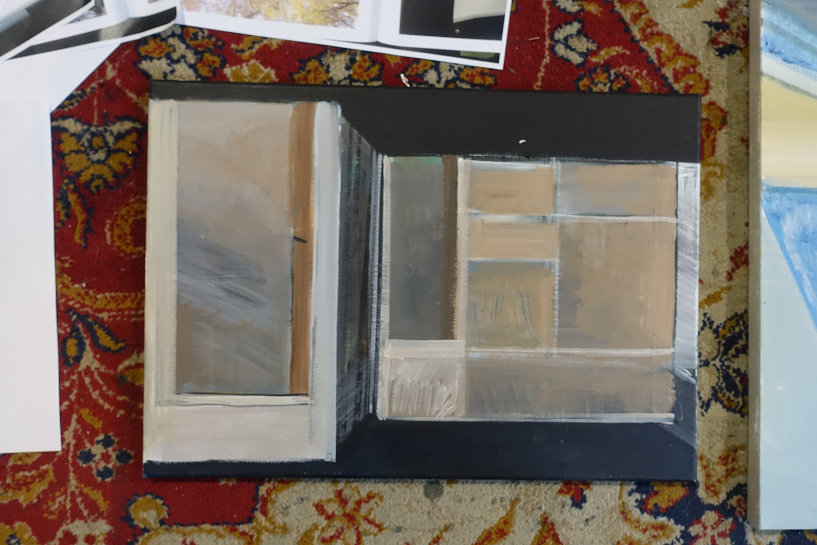
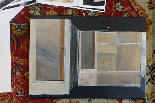
‘I started to look closely at the photographs of Rietveld’s houses from the outside and inside’, says Kiesner. Then, as with the large-scale realisations, small collages were created from photographs from the book, which later served as sketches for larger paintings.
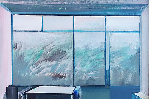
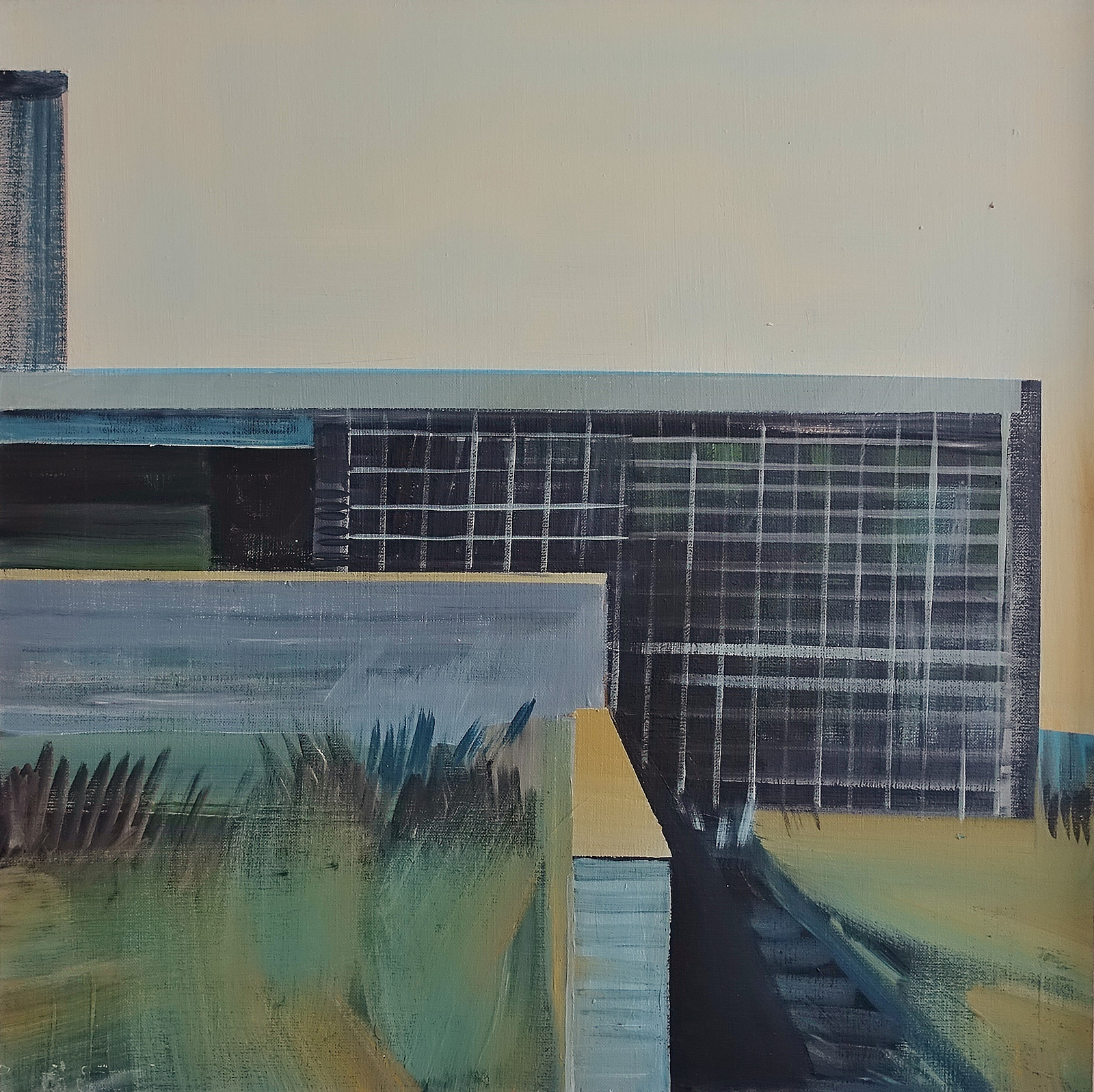
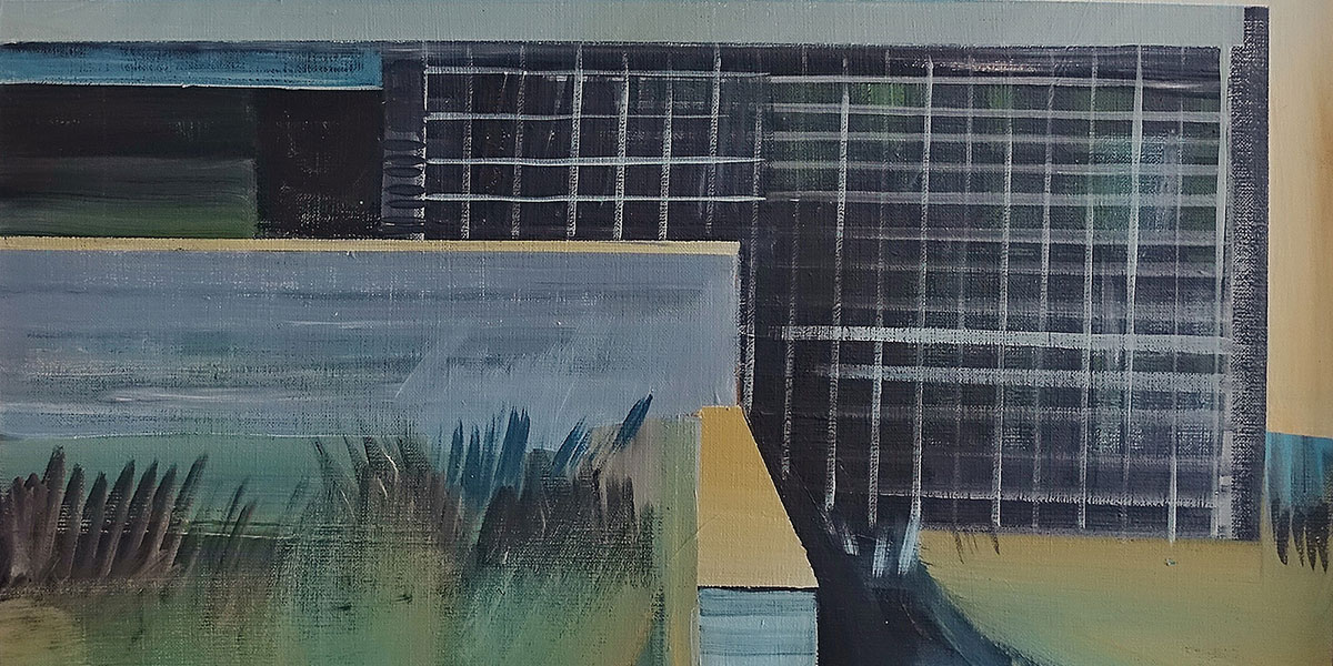
Horizontal, banded windows on the façade, contrary to appearances, provide more light than those in the load-bearing walls. Most of it, however, comes in through the large glass surfaces facing the garden. Large, unobstructed windows – a characteristic element of Dutch architecture, even traditional architecture, where ‘the sky is too low’, to misquote the title of a cultural studies book. A high horizon, the sky occupying three quarters of the frame, land and sea. Painting buildings from the outside, over the years Maria Kiesner lost the landscape in them. It is present in the miniature series, but behind the windows, filtered through the glass. The light orders the design elements.
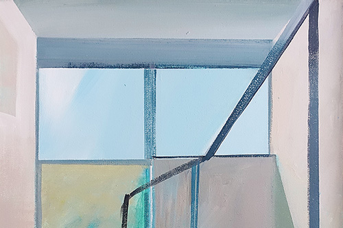
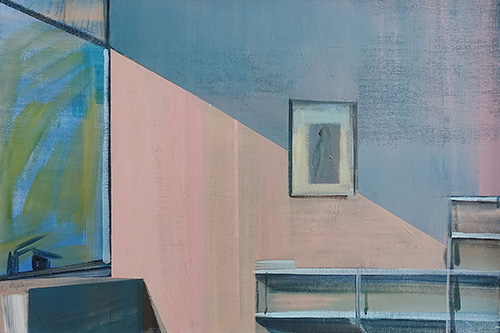
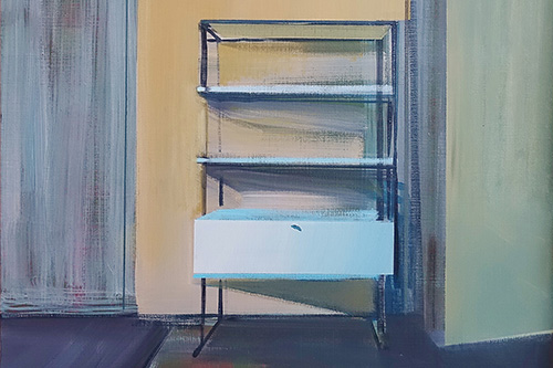
‘The appearance, especially of this interior, the main room [...] was designed in a much more purist form. At the time, I tried not to supplement this flat with objects that had to be adapted to the architectural layout each time’, Lachert said of 9 Katowicka Street, a few years before his death. In spite of his efforts, however, the home gradually grew additional layers: on the fireplace – souvenirs from his travels, including, of course, ceramics from Delft; on the pipes running along the ceiling – small sculptures; on the walls – decorative mounted plates. The spirit of simplicity, typical of modernism, gradually evaporated. Kiesner also gives the houses and interiors depicted in the miniatures an individual touch, but with her, the process is the opposite: she simplifies the shapes of stairs, tables and chairs, distilling their forms with light.
She herself, she says, imagines the Rietveld houses drawn from the photographs as similar to those of the professorial Bauhaus colony in Dessau. She would like to finally look inside them one day. Perhaps then she will then find in one of them what she put there herself.