To build form through colour
Sparkles of light glittered in the crystal panes; in coral groves, goldfish and jellyfish swam, touching each other with their mouths, fins, slippery tails; crabs and turtles stared with huge eyes; emerald fields of seaweeds were iridescent with the many-coloured starfish and urchins who had their home among them, bands of yellow sponges hung from steep rocks...
The colourful crowd of deep-sea dwellers: crabs, lobsters, shrimps, seahorses, algae and shells, like those from the Mermaid’s Palace, described in this extract from and Icelandic folk tale[1], are all present in Darek Pala’s latest cycle, Aquaria. Previously marginal, they have now become his main theme. The first thirty “aquarist” paintings were produced this year before the summer holidays, all on square, 32x32 inch canvases. Then, two-metre pieces and compositions painted on wooden boards nailed together joined the series. He is said to have brought to Warsaw only a fraction of what he’s got in the studio in Miami.
Why aquaria? Pure imaginative impression? The observation of nature? Pala does, in fact, observe a glass vessel in the patio of his house every day; but the colourful kingdom of the sea had tempted him before he went to live in Florida four years ago. Fish were already appearing in his pictures at that time. A goldfish in a jar provided entertainment for a lady relaxing in her bath. A blue fish was at the same time a delicacy and an ornament to the plate on which it was lying. Painting scenes on exotic beaches, the artist admired water and sea creatures. He used to arrange picturesque still lives on tables in seaside restaurants.
In painting the latest series of Aquaria, Pala drew on his personal store of motifs and patterns, which he has been recording as small drawings in a sketchbook. In the paintings, he keeps to a few forms: zigzags, coloured bands, geometrical figures, which he puts together in various combinations. All the pieces are on the same theme, yet each one is different. Several Aquaria on the same wall would certainly not be boring.
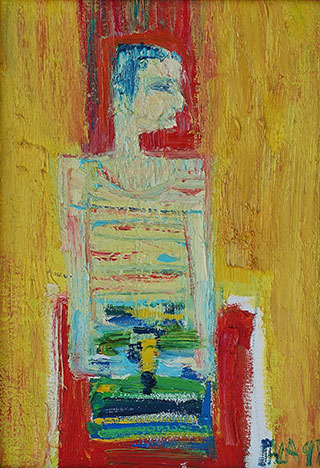
Dariusz Pala has always painted colourful pictures, very authentic in their naiveté. They do not belong to that trend in modern art which requires the form to be minimalized, reduced. His paintings are created instinctively. He uses colour, light, the concreteness of matter, its texture, to express sensual perceptions. It is an art freed from the constraints of intellect. Although there is no shrewdness about it, there are solutions which bear testimony to colouristic maturity. In his pure, joyful contemplation of the world Pala defies the contemporary, postmodern cult of ugliness.
Even though Dariusz Pala still intuitively constructs his paintings reaching to the foundations of colourism, he has clearly purified their form, subjected it to synthesis. He has rejected the literary charm of anecdote. The composition has also changed: built with strongly contrasting coloured planes, it has become more rhythmical, more powerful. The latest “aquarist” paintings are often composed in an oval or a rectangle, and filled with animal motifs, which sometimes evolve into abstract shapes. By clearly outlining the aquaria, the artist emphasizes the divide between the world inside them and the background. The line which separates the two planes sometimes becomes an ornamental, mosaic-like frieze. The division is reinforced by colour: apparently, Pala likes colour duets. He boldly uses contrasting colours, or colours of very different tone value, such as yellow and vermilion, azure and navy blue.
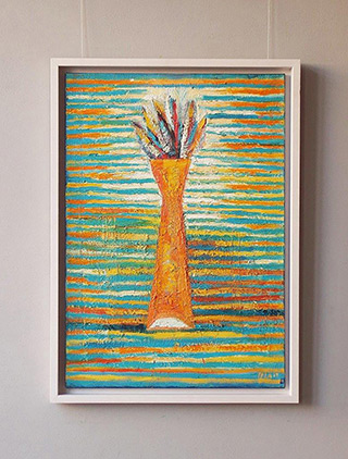
The need to “build form through colour” and getting across the “conception” are the most fundamental features of Dariusz Pala’s painting. As a young artist he moved within the sphere of traditional Cracow colourism, still immersed in fin-de-siècle world-weariness. But while still a student he broke with the grey-and-purple range used by Boznańska and Weiss, moving towards rather ferocious expression. The aquarium theme, developed in many variations, provides an excellent excuse to indulge in the “play of colours” commended by the KP group. Each painting carries an arrangement of sophisticated colours. Pala builds the surface from vibrating matter, shimmering with unexpected tone combinations. As always, he chooses bright shades: luminous azures, sunny yellows, orange, light sandy ochres, always pure and resounding. But he has modified the colouring we’ve already got used to: he saturated it with reds, added darker streaks of brown, navy, indigo, sapphire, ultramarine and cobalt. He loves vibrating, thickly applied smudges. Laying on bright impastos onto the layers of the painting’s matter, he enlivens it, fills it with light. He uses warm underpainting under cool backgrounds.
As usual, Dariusz Pala works with passion on the texture of his pieces. He emphasizes their tangible, plastic corporality; as if they were made not only for the sense of sight to contemplate. Thick, expressive, diverse matter confirms the inner joy of painting, the carefree enjoyment of life. Pala does not easily consider his paintings finished. He often comes back to them and delights in painting on old pieces. Like a true colourist, he likes to get his painting “dirty” first. He takes a long, unhurried time to paint. He values the creative process more than the finished work. He re-paints his pieces to learn more about the links between colour and paint texture. He pushes the painting further and further, until he tires its colours and strips them of vitality. Using a thick brush he applies easy, overlying streaks. The heavy structure of the colour is fixed in the hardened suspension of pigments. Spreading it over pictures he dissolves the motives he painted, so that the pieces paradoxically become abstract.
Pala’s latest pieces are painted on open-worked frames made of wooden boards. He once had the idea to sculpt a relief in Styrofoam, but he gladly replaced it with putting paint on wood. An open-worked structure is fun for the artist; it allows the painting to grow autonomous, to move out into space, and the painter - to let go, to release the passion for energetic large-scale doodling. With such a structure, paintings change depending on the point they are viewed from. But Pala composes them for an oval frame! A striving for greater synthesis is observable. He makes the sea creatures and plants similar to rounded geometrical figures, overlapping and mingling. By obscuring the contours he builds an atmosphere of ambiguity. The colours, too, evade commonplace observation: they are not like the ones we know from the biology atlas. In the end, it is difficult to tell whether they represent a floral, animal or abstract form.
No wonder, then, that Pala’s Aquaria - free-and-easy painting immersed in colour and texture - have something in common with the street art of graffiti, with the spontaneous artwork of a child or with the surrealists - not the dark visions of Salvatore Dali, maybe, but the poetic compositions of Joan Miró, full of soft, colourful, vibrating shapes.

Aquarium with a fragment of mosaic
Luminously white shells, mussels and seahorses are separated from the background by a structure reminiscent of a mosaic frieze. The artist has laid it meticulously, using tiny white, yellow, vermilion, azure and orange tiles. No wonder that the cover, painted in profile, looks a bit like an arch in an arcade. Or is it a coloured stripe in the tiling surrounding a swimming pool in which sea creatures have come to live? Colourful triangles, zigzags and spirals enliven both the clothes of the characters in the painting and selected parts of the background. It seems that if he could, he would cover the whole picture in those abstract patterns. In bathing scenes, mosaics surround swimming pools by which high society basks in the sun. Why not put them around an aquarium? Freely applied streaks of cold carmine and hot vermilion shift towards orange, gold, and dark yellow. The colours gain intensity when laid on black underpaint. Even white sea creatures assume pink hues under the influence of the water.

Aquarium with a coral tree
A plain plane appears darker if you set a brighter blotch against it, and lighter if contrasted with a darker one; a grey plane combined with a red patch becomes green
– that is how Józef Czapski, the great colourist, interpreted the notion of “the play of colours”[2]. Dariusz Pala also believes in the power of colour contrasts: warm and cold intensify each other’s impact. The contour is where they meet. The yellow line shaping the aquarium, brightened with sliding patches of light, contrasts with the dark navy background. Aiming at a variety of shades of blue, the painter filled the bowl with lighter water, consisting of mingling patches of cobalt and lavender blue. He added dynamism to the composition by putting soft-shaped jellyfish and bright gold twigs of coral in the aquarium.

Goldfish
A square within a square. A structure which looks like the turning line of a maze. Albersian geometry? Not at all; Pala’s paintings most certainly can not be classified as geometrical abstraction. A broad, brutally applied stroke demarcates the internal borders of the painting. It divides the form of the vessel form the background, built with freely shaped, fuzzy patches of orange, ochre and yellow. It creates a static frame, preventing them from spilling into the background. Shoals of silvery fish find it hard to swim through the red (mixed with black) matter trapped inside the aquarium . Their shapes are merely hinted at by fluid, luminous streaks of white, cobalt, deep carmine and sunny yellow. Putting strokes of paint on the plane the artist moves so far away from the original motif that it can no longer be precisely reconstructed.

Glass ball
A ball-shaped aquarium inscribed in the square of the canvas. A circle in a square, or a meeting of the archetypal ideal figures. A clash of roundness and angularity. The classical dialogue between elementary warm and cold tones. The colourists used to say colour only comes into existence on the canvas in contact with other colours
[3]; they used to repeat this statement as a mantra. Jan Cybis wrote in his diary: In painting, content, subject or nature have always been but excuses for the abstract play of forms and colours
.[4] Here, a whitish yellow background is enlivened by blending patches, thickened with navy, indigo and black. They contrast with the blue and cobalt pigments which give depth to the deep blue sea. The world of the sea fauna is brought to life by “lights in the picture” – soft touches of white and yellow impasto.

Pirates’ aquarium
Another painting within a painting: a wide, square border painted on the canvas creates the illusion of stretcher, so the plane of the painting appears bent. Pala has already captivated us with a line of black and red flowers in vases, whose strongly geometrical shapes he outlined with a bold contour; now he separates the carmine of the background form the red water with a black line. Among dense, energetically applied black strokes the swarming forms of sea creatures can be discerned. The changeable colour is effected by shimmering, vibrating dots. Resonant carmine is lit up with lightly applied yellow smudges. Through the intuitive expression of the red the artist comes close to the ideal of pure “colour” in painting. The painterly, decorative structure softens the effect of piercing emptiness and tedium of typical “dry” monochrome.

Attack of the swordtails
A few parallel strokes of black paint marking the shape of the aquarium separate its interior from a thick carmine background. The dense texture of the painting and the claustrophobic clutter of aquarium motifs deprives it of space. The artist has crammed them like seafood on a tray. Light impastos skimming the surface of the dark red paint reveal animal shapes.

A memory of the tropics
The painting looks like a densely woven rug. It is the result of the painter’s sensual relishing of colour combinations. The rim – the black contour of the aquarium – separates its interior from the background, intensely yellow, brightened with a transparent orange glaze. It has been developed through many approximations, and the application of innumerable layers of paint has built the microstructure of the painting. Pala has translated light and space into the language of living colours, combined in rhythmical order. Together with the texture, they form a physical unity.

Flying fish
The painting reflects the ideal correlation between the touch of the artist’s hand, the pigment he uses, the open-work structure of the ground and the sensuous texture. Pala tries to go beyond the colour which is natural to things. He proves that natural, local colour is of little importance. That’s why the ultramarine-cobalt shape of a bird, or maybe fish, executed in sweeping strokes, blends with the choppy blue streaks cutting across the wooden ground. As if they were casually thrown onto the contrasting patch of intense carmine. This dynamic composition is akin to the street aesthetics of graffiti.

Swan Lake
An escape from faithful imitation of the forms of nature can be very attractive. The artist bestows the same moon-like shape on both fish and birds. The levitating zoomorphic forms may be those of a soaring flock of sea birds, or maybe of lovely shells scattered on the sea bed, seen in a bird’s-eye view. Colour which is not part of the conceived play of colours, but a mere imitation of nature, has no artistic impact
[5] – let us repeat Jan Cybis’ words while looking at the flying swans painted in different shades of white. Again Pala has enclosed the composition in an oval frame. This time it looks like a lake.
Notes and references
- [1] Icelandic fairy tale Of a Loving Mother and a Sea Mermaid, quoted after: W.Markowska, A.Milska, Za siedmioma morzami, za siedmioma wyspami, Wydawnictwo Morskie, Gdańsk 1985, p. 48
- [2] J. Czapski, Józef Pankiewicz. Życie i dzieło. Wypowiedzi o sztuce, Warsaw 1936, p. 183
- [3] J. Cybis, in the catalogue of an exhibition of the K.P. group in Club Polonia in 1931, quoted after Myśl Narodowa, 6 December 1931, no 435
- [4] J. Cybis, “Aleksander Kotsis”, in Głos Plastyków, 1932, II.3
- [5] J. Cybis, op.cit.


