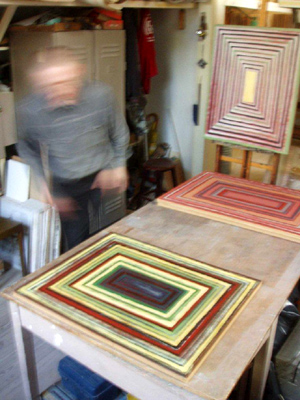
Majcherowicz’s Colorful Lines
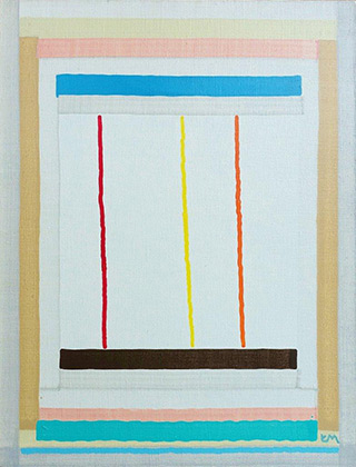
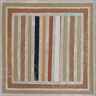
Most of small-sized paintings created by Łukasz Majcherowicz within the last several years look abstract at the first sight. Most of them represent outlines of rectangles formed by lines which are sometimes transformed into wider bands and which seem effortless but, at the same time, quite clear when it comes to the painter’s intentions. In places left empty there are other things marked in a similar way – with horizontal or diagonal, though sometimes even vertical stripes. In his other works, the course of those lines is meandering, though too dense to produce a popular ornament and not enough winding to build a complete labyrinth… The artist also painted at the same period other kinds of canvases, but there were quite few of them.
What makes those peculiar works of Majcherowicz really stand out is their minimalistic composition, often limited to layouts of lines, which seem quite effortless but follow a clear order. They create some kind of borders, enlarge into stripes, leaving behind spaces where something else happens or, clearly denser, become a system of quite simple labyrinths and gantries. Apart from layouts, it is the composition of colours that comes to the fore. What is left is the impression that the artist is quite serious about colours, cause his paintings share the same tonality.
What is determinant, apart from layout rules, of those intimate works by Majcherowicz, is also their topic suggested in the title which, however, does not fully reflect the content intended by the artist. A conclusion can be drawn that the reason behind each topic is not only the willingness to guide, in their interpretation of the respective work, those viewers for whom the formal game between colourful stripes is not enough to understand that the painter goes beyond simple rules he follows. There is an artistic code of conduct behind it.
Let’s track together the tricks the painter has been using in his recent works, exhibited these days at Galeria ART, not so much to define or construe them accurately, but rather to emphasize the consistent yet diversified ways of searching for expression and meanings of simple layouts the artist has willingly discussed. One of the reasons to do it is that his work has turned out particularly effective. It is evident that those forms of expression do not encompass all of the painter’s experiences reflected by the exhibition, nor are they a register of all the attempts made by him within the last several years, but they are considered by the artist himself as important. It must be emphasized, however, that it is the curator of the exhibition who set the criteria for selection of Majcherowicz’s paintings exhibited in ART.
The artist’s interests are much wider than the canvases exhibited – he also paints on walls, teaches wall painting techniques and technologies at the Academy of Fine Arts in Warsaw and restores paintings and architectural ornaments in churches and historic buildings. Easel painting is, however, the most private part of his artistic activities.
Half of the paintings shown at the exhibition are represented by a series of rectangular frames inscribed one in another, some of which are left open and which have often been painted in colours which strongly contrast with each other. By emphasizing or distinguishing one of them and slightly transforming their initial layout, Majcherowicz attempts to get as close as possible to the intended title of his work and to create a visual support whose purpose is to generate a significance association connected with the title. It can be seen in most of the exhibited paintings.
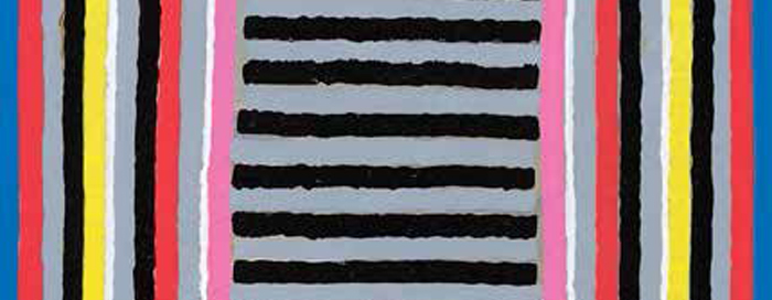
In The Thank You Card, the central, smallest rectangle constructed in different proportions than the other ones was highlighted in warm pink and filled in with a series of horizontal lines. It reminds of a card full of letters and it makes a reference to its title. In The Forest, a series of symmetrically distributed, vertical lines separated from each other with grey stripes is depicted on an organic, mauve background: diversified colours emphasized by contrasts can encourage in their viewers an impression of light reflections or sudden obscurity in a forest thicket. A Sheer Curtain – its structure does not involve consistently closed rectangles but stripes which suggest them and systematically build a window which seems deeper and deeper – it reveals itself as a flat shape subtly greyened with surrounding colours with the texture of a canvas warp: as for The Mirror, it strongly exposes its shiny whiteness thanks to a contrast between the surrounding blue and red rectangles. In the rectangular, destroyed Window you can see a simplistic and empty, cloudy winter landscape, horizontally cut in half, as miserable as the window itself; the artist multiplies horizontal contrasts of colours in the center of another painting – The Landscape: this time, a large stain of a warm color is reminiscent of a hot summer. In another painting – A View from a Window – where the object which enables us to see title contents was constructed in the same way as other ones – spacially – the painter introduced multicolored, slanting lines of various widths, which dynamized the topic in an evident way; slants also appeared in the painting called A Dune, Sand and Pigments and in The Rainbow – each time they are organized in another way in terms of the title topic, associations expected by the author, and, finally, painting techniques used.
The aforementioned works do not include all of the transformations of layouts constructed as series of smaller and smaller rectangles – Majcherowicz’s interests are not restricted by landscapes often seen through windows. In The Pulpit layouts of rectangular, multicolored frames are penetrated crosswise by irregularly flowing streams of light which brightens everything; in this case it is not a suggestion of what can be seen but rather what can be approximated with words coming from that place. In The Ray of Light blue rectangles with various luminosities, which become smaller and smaller and which are bordered with not too wide red frames, lock inside a narrow orange stripe – they define a hardly noticeable phenomenon; in the same symbolic way, Archangel Michael was marked as light – with orange and yellow colours. His commanding character finds its reflection in sharp and irregular color lines, which reach colorful fields located further on. A similar attempt to zoom in with a color and structure of rectangles which get smaller and smaller is made in The Black Sea and The Red Sea – in those two works, it is not that much of associations with concrete things or culture symbols of spiritual nature that were targeted by Majcherowicz’s efforts (cause both great seas are blue after all) but their names and intercultural usus. Symbolic representations of the essence of larger phenomena is what characterizes to an even larger extent the diptych Nepal-India, which has not been exhibited yet – in this case a topographic contrast which affects the specificities of both territories turned out to be helpful.
Apart from exploration of rectangle frames, the artist has been long attracted by the shape of meander, which outlines the way in a centrifugal manner which allows it to become a sort of labyrinth – that’s how contents different from each other have been created with ease. The red Meander became a mere opportunity to build spatiality, another painting with the same title depicts a pair of separate meanders with centers located in different points, which is enough to leave room for various interpretations. Its further variants – that is Manowczyk I and Manowczyk II [Backroad I and Backroad II] – two interconnected meanders – express different contents with a form which is only slightly transformed: the first one represents roads which get broader and broader or narrower and narrower, depending on where their beginning is according to you, and other passages with an invariable width along their way and, at the same time, emphasize the similarities between departure and destination places; the second one accentuates exclusively the last aspect of the road, while the form is left unchanged. The complex Polish Landscape benefits from the artist’s experiments with meandrical passages and rectangular structures, which resulted in a hard-to-travel, multilayered space closed with glazed walls, which opens up to an unexplored depth and which splits the injured colors of our national flag; the structure of that painting was used for symbolizing the current condition of our community.
Another by-product of Majcherowicz’s rectangular structures is a group of doors, important entrances and gates – their form itself determines a series of symbolic toposes, which are just as important in literary descriptions and visual representations as a road or labyrinth, present in various cultural mythographies and iconographies for many years. The exhibited collection includes Solar Gate 2 (from Rotations), whose only difference from paintings based on rectangular structures lies in their replacement with squares; it represents a gentle brightening of the light which drifts away from background. Another one – The Gate - with a regular composition, exposes the entrance itself and puts an emphasis on entering something dark and unknown; Gate I – with its exquisite composition of colors - reflects the physical condition of the enterer rather than discusses the nature of entrance. And, in the end, there is The Nazi Gate, composed in a totally different way, exclusively out of a layout of colorful rectangular areas heading to brown shades, which remind the tragic consequences of their dominance; the content is clear, but its full scope included in the structure used could gain a fuller interpretation if the evolution of that form was investigated throughout the whole series by the artist, called Rotations, which has not been exhibited yet.
The aforementioned series is represented at the exhibition by two other works: Gate 1 and Gate 2, which partially develop other compositions which cannot be admired at the exhibition. The paintings themselves – prepared in a vertical and horizontal option – depict two gates connected to each other in a way preventing anybody from getting inside. This is where I should briefly discuss vital transfigurations of gate sets in a series called Rotations by the artist himself, not fully included in the exhibition: in various compositions of that series a blackening line is more and more expressly incorporated among four gates distributed in a different way; the line connects them but at the same time excludes the possibility to enter them. It reminds more and more of the Nazi symbol. In that series, the artist usually used the simplest methods of expression: in most cases, he added new structural elements or basically reconstructed the overall composition. The meanings of The Gates were built through transformations of the forms of specific paintings, in case of extended Rotations composition changes can be seen throughout the whole series; the movement of used forms created content variants which expanded on what had already been expressed.
In the collection exhibited in ART Gallery, Łukasz Majcherowicz did not restrict his art to the aforementioned forms of expression. In other abstract works where he also used lines – like A Dot, based on a composition of squares – he allows himself for an even more free artistic approach towards those shapes just like in a dark Night,- painting with a band-like structure, crowned with an arch or in The Comet, - constructed centrifugally with diversified, colourful, smoothly curved lines. In the picture named after Witkacy’s drama – The Independence of Triangles – apart from the triangles he introduced irregular quadrangular shapes; the painting owed its expression mainly to the colour itself. The same thing happens in The Sail of Ulysses: the artist made use of geometrized shapes in that painting, while also adding an expressive, dark, irregular stain whose shape puts the hero’s fate in danger. Despite a frequent use of geometrized shapes, Majcherowicz treated other paintings – e.g. The Pyramid - which represents a typical metaphorical painting from the past - as a whole. Finally, Melancholy was doctored as a collage or, should I rather say, a traditional assemblage, created on the basis of a “lost and found property” – a small window frame.
The artist never ceases to strive for a fuller implementation of his own idea of painting. The exhibition as it is should rather be regarded as a certain stage, although its significance should be emphasized. Apart from a series of simple and successful structural procedures, Majcherowicz has also worked out core components of his own signature color scheme with no detriment to their natural looks. The artist owes that effect to an impression of organic material: he takes care of those colors by binding even the most diversified components of pigment binders according to his most important artistic goals. He also strives to demonstrate the quality of the substrate – be it a textile, board or a panel – maintaining the simplest way of using his brush: continuous, apparently simple line with which any object is painted, which reminds a functional color laying over any surface. In this case, Majcherowicz attempts to discover and use in his small easel paintings values characteristic for wall paintings rather than taking an excessive advantage of various technologies he knows better than painters who got used to acrylic or oil techniques.
He paints flat and matt paintings, often sharpening simple yet refined colors with whites, generally abstaining from saturating them to the fullest; if needed, he doesn’t shy away from attenuating or patinizing them, although he also uses blacks or browns whenever he intends to create a different mood in his paintings or to strengthen the contrast with the emerging sound of a gentle luminosity. Majcherowicz builds various arrays of colors using ochres, browns, rusts verging on reds. He prefers warmer tones, even though he also uses deep greens, saturated blues, shades of coarse textiles. His paintings show his commitment to building an accented array of colours more than his personal preferences. For the most part, it is reflected in exquisite arrangements and contrast development, which is accompanied by formal operations involving lines, often diluted. Let me emphasize that, in most cases, the painter seeks rarer, less obvious colour compositions; you can also observe in those attempts a continuous effort to minimize forms of expressions and to make colours shine without resorting to easy clichés and tricks. Majcherowicz wants his whites or warm shades like yellows, oranges, reds and pinks, and sometimes blues, to shine. He seems even more committed to demonstrate an ephemeral life and variable nature of colour – when you look at his works from a distance, their tones change: conflicts between colours fade away, new harmonies are established and the paintings exude calm and peace as if those things which seem important and dynamic when watched from a short distance turned out less relevant, ephemeral and local when a bigger picture is at stake. A focus on balance, inner harmony, even if concealed and remote, calm and composed approach to never-ending transformations are all in the artist’s mind.
Artistic structure is supported by the line which shapes Majcherowicz’s paintings, which is also an element of their structure that has become more important for painters since the re-introduction of the abstract to the European art. This tradition is also present in Poland in different variants. It is, therefore, not that hard to enumerate various forebears of Łukasz Majcherowicz’s creative endeavours.
Nearly a century ago, having delivered his lectures at the Bauhaus, Wassily Kandinsky recorded in his book called Point and Line to Plane his conclusions on basic lines and their functions, first and foremost in abstract art using geometric shapes; he also discovered their different meanings in a painting and their connections with colour, which has become a good point of departure for further artists. Malewicz concealed in his paintings traces of vital directional tensions in space and sketched shapes merely with colour edges; Mondrian split energy fields shown as blue, red and yellow rectangles with colouristically neutralized stripes. As for Polish artists, Strzemiński drew from his analysis of the dynamism of contrasting lines prevailing in art since Baroque and their inconsistency with colour composition functions a conclusion that it was necessary to introduce a new type of line – a unistic one – identical as the colour and texture of a painting; this is what his painting expression was all about. Stażewski, however, used to stress the structural and emotional importance of the line and searched for consummate colours.
Painters other than representatives of abstract art where the line is treated as one of the most important structural elements often cherished a personal approach to it, which found a reflection in their works. Erna Rosenstein, committed to exploration of the subconscious, whose paintings include some kinds of sudden highlights of tumultuous stories, used to say that for her the line was like an injury, violence, unexpected space scratch. Jan Dobkowski, who for decades experimented with possibilities to express contents through different line transformations and who used them in his paintings repeated that he cultivated his own movement – linearism – and that a developing line was a trace of his own thinking…
Łukasz Majcherowicz paints effortless, colourful lines next to memorizable, evident layouts of geometric shapes, mostly rectangles or squares, transforming the latter according to other goals arising as he paints. He remains on the spectrum of abstract art: he extends its scope, while exploring at the same time various topics – things, situations and wider phenomena – which, if represented in a simpler way, restricted merely to a visual tangibility and legible allusions – would be deprived of understatements, aura of poetry, unexpected generalization and of a directly demonstrated strength and significance of the structure, order and joy of colour. All of those things are present in Majcherowicz’s works. The artist draws from a few sources, while maintaining the meanings which emerge when all of them are activated at the same time. It is his own personalized way of using a simple and popular form of expression.


